SCELF
VISUAL IDENTITY /
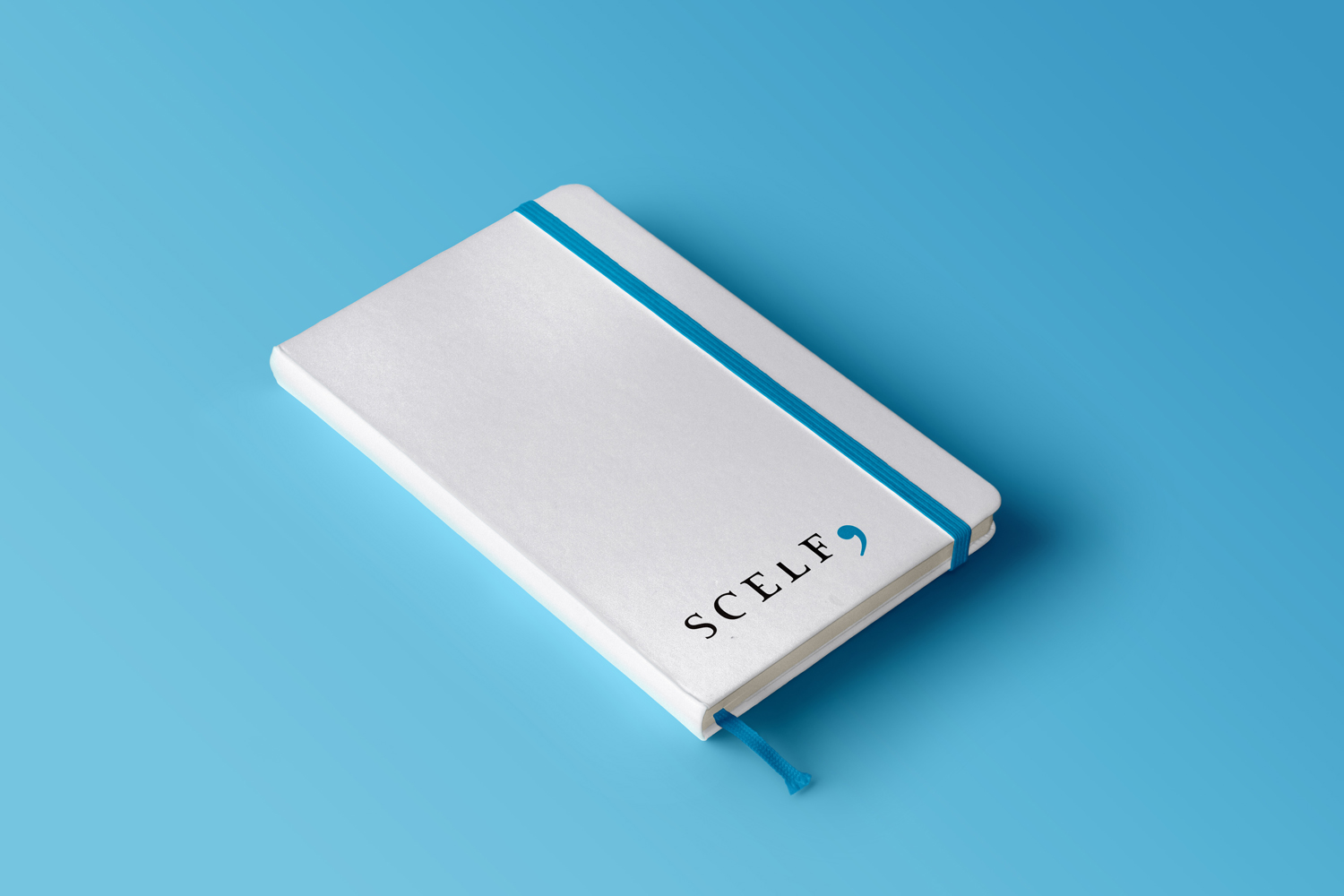
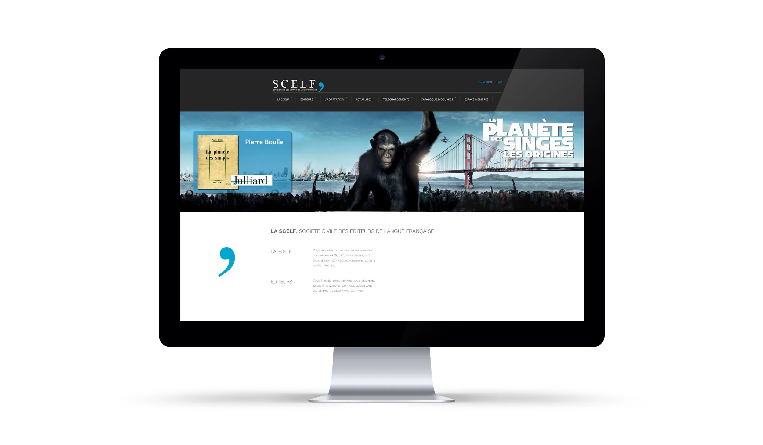
Visual identity of SCELF, Société Civile des Editeurs de Langue Française, copyright society which brings together publishers that directly manage audiovisual adaptation rights of their publications. This included logo design, art direction and stationery.


Wordmark is characterised by and leverages the vintage chic of sharp and pronounced serifs, a high contrast, and refined letters. A serif typeface for display that takes its inspiration from the erosion of stone carved letters appears current in its simple forms and cuts, yet with a sense of legacy in its origins, and sense of experience in its associations.

The comma punctuation mark as an inseparable graphic element of the identity provides a solid foundation for some strong and impactful colour contrast in print. The colour palette brings together the urban qualities of blue, the clarity of black and white, and a striking and electric cyan.


