


VISUAL IDENTITY / BRAND POSITIONING / BRAND STRATEGY / BRAND ARCHITECTURE / PACKAGING / WEBDESIGN
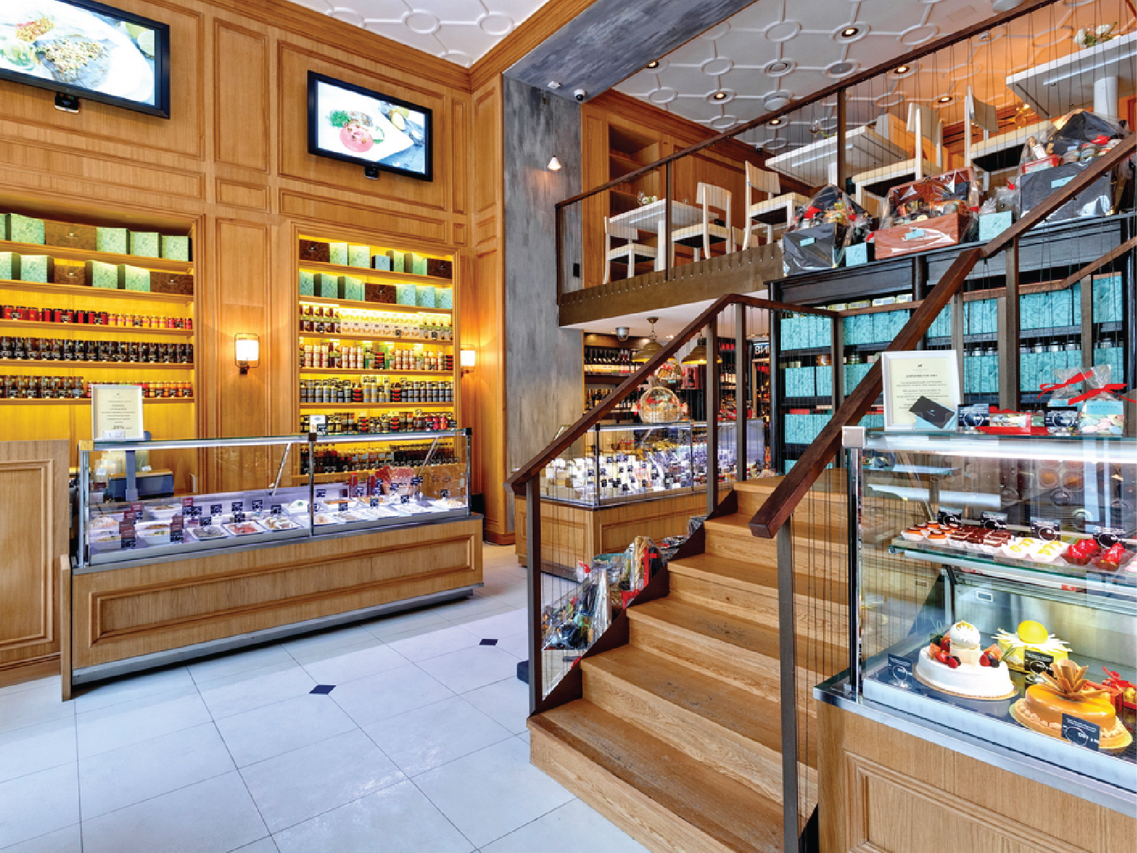
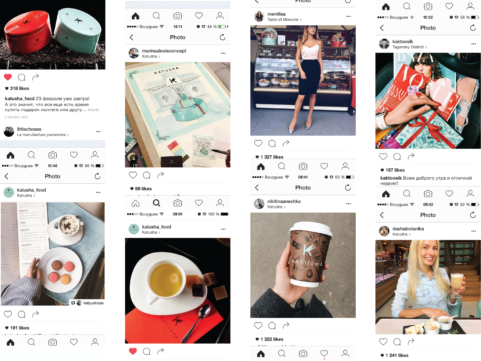
KATUSHA is gastronomical excellence. A luxury brand that presents a rich and varied range of delicacies and prestigious quality products. Represented by a Gastronomic boutique, Restaurant and Chocolaterie, the challenge was to create a visual identity and complex brand architecture that would communicate a modern Russian brand inspired by the traditional French “Épicerie fine”.
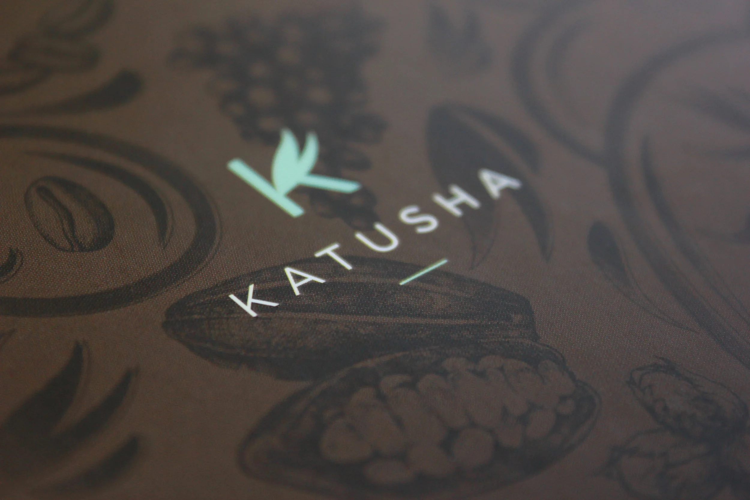
The logotype effectively plays with the traditional and personal mark of a craftsman and leverages the more formal qualities and experience.
Logotype and typeface have something of a dual nature, finding a contextually appropriate balance between the familiar and the unusual, technicality and character, the very personal legacy element of the K, and a modernity and restraint that sits well within the context of rich material detail.
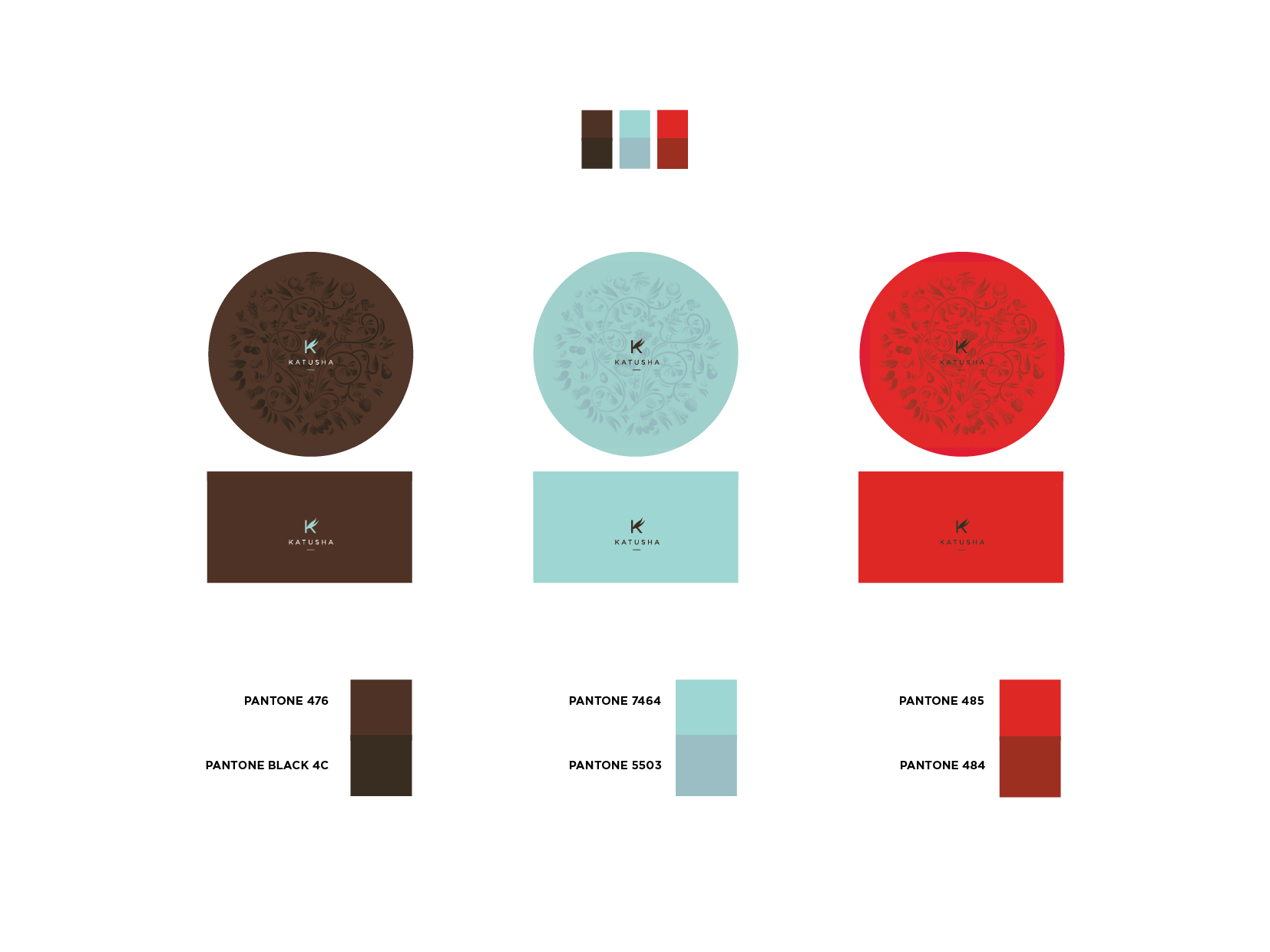
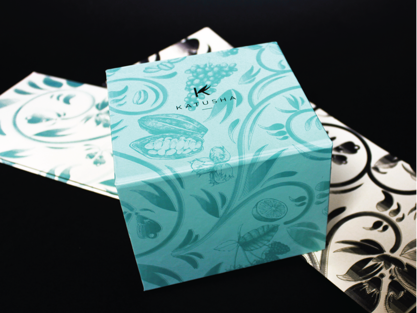
The illustrative work is a particular highlight. Inspired by traditional khokhloma painting, irregular lines and an etched quality feel distinctly and authentically period. There is a good relationship between light and shade, moments of detail and areas of space and simplicity. Although not mirrored, crest feels balanced, with variations in the food illustrations, leaves, and small imperfections establishing a strong sense of age, legacy and craft. The initial impact through restraint of logotype and colour palette is followed up by a lot of front of pack detail.